Picata.fr : all your tech company need
A new interface for our customers
Goal
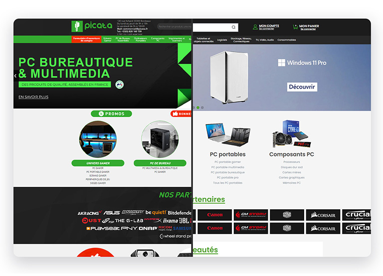
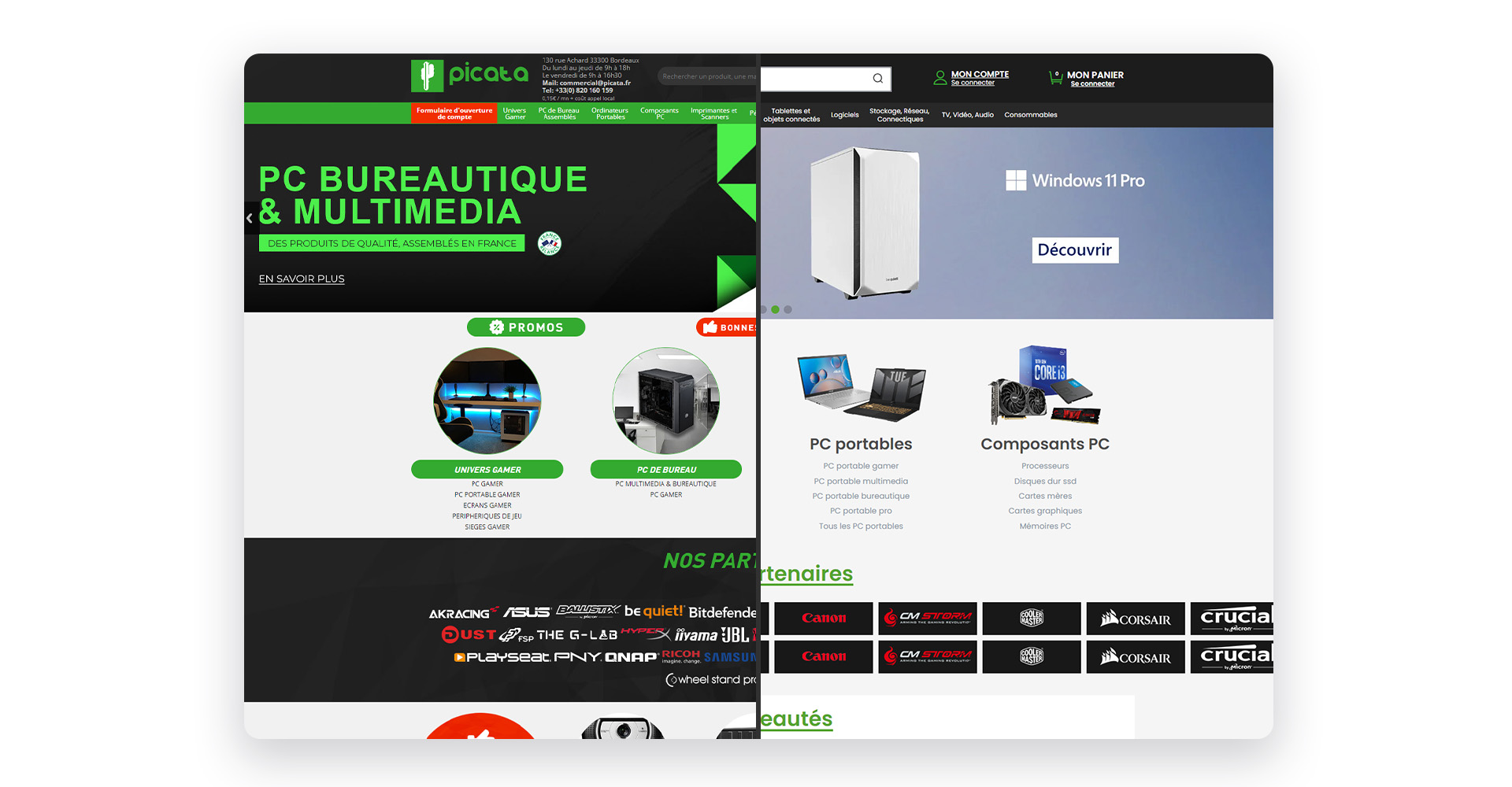
Picata.fr is an e-commerce website specializing in the sale of computer products tailored for businesses and professionals. Boasting over 7,000 product references and a team of more than 100 collaborators spread across France and Asia, the brand stands as a major French player in the realm of professional e-commerce.
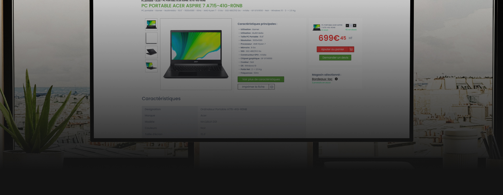
Operating solely online, the company has faced increasing demand and the emergence of the latest technological releases. I was able to enhance their sales platform by optimizing the user interface and revamping the site's graphic design.
Process
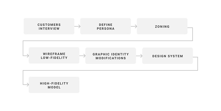
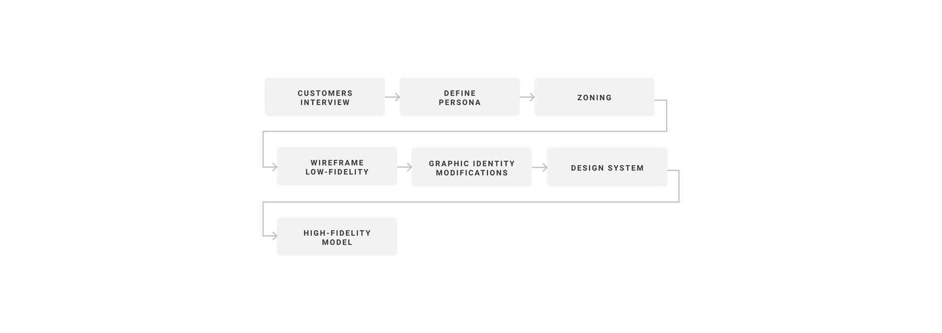
In order to make corrections without disrupting the entire website and inconveniencing the current clients accustomed to its interface, I would need to initiate the entire design process. This involves understanding the initial build of the website and figuring out how I could improve it while maintaining its familiarity for existing users.
Visual design (UI)
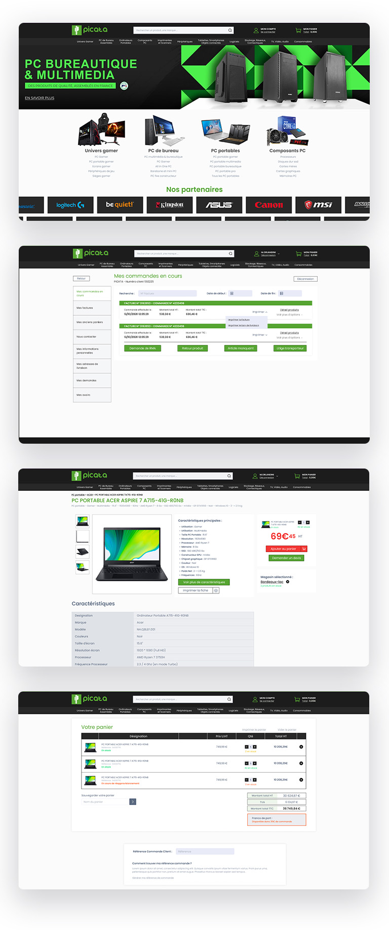
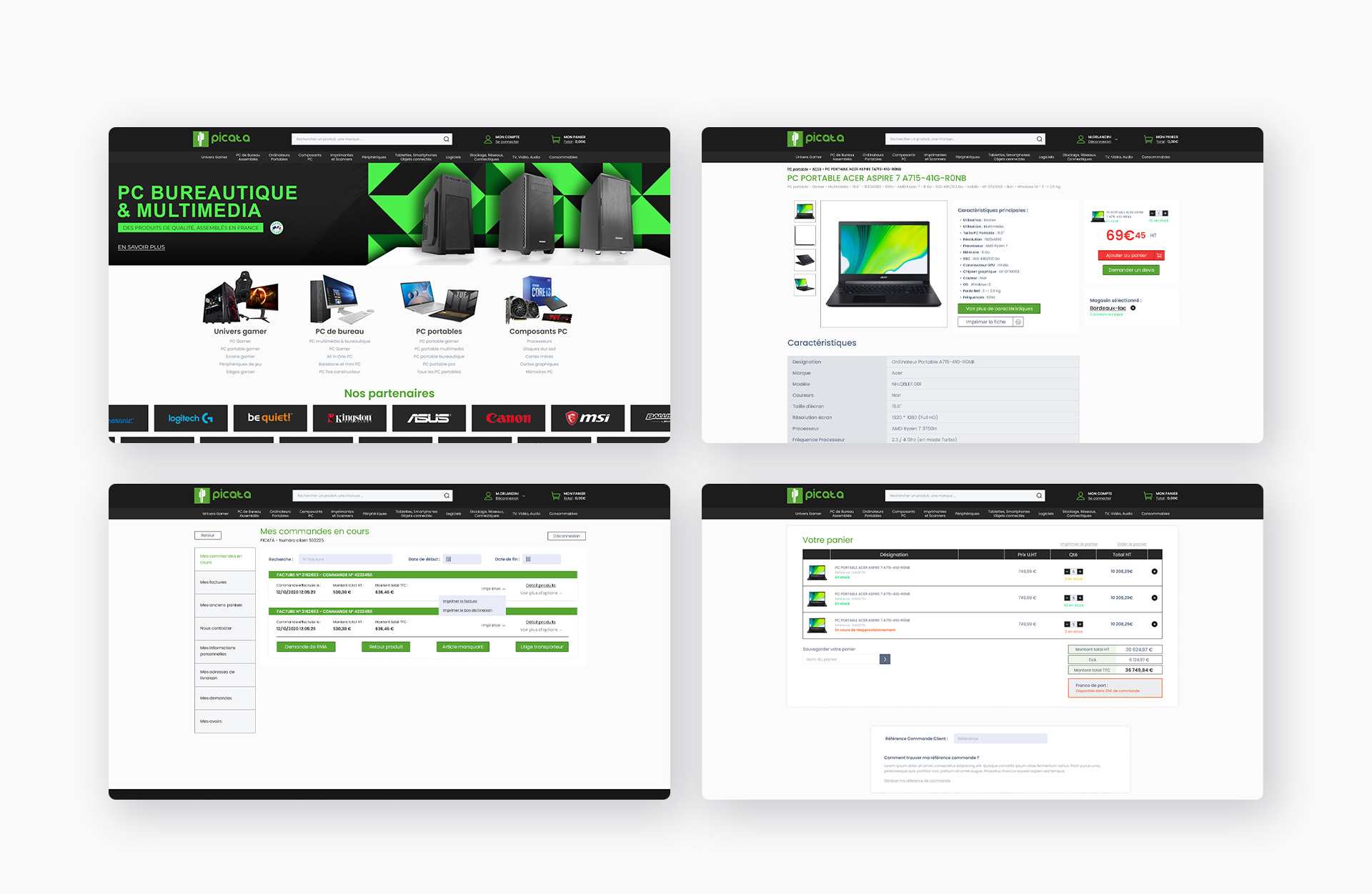
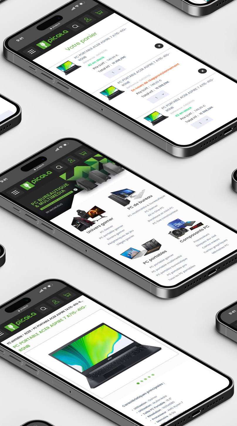
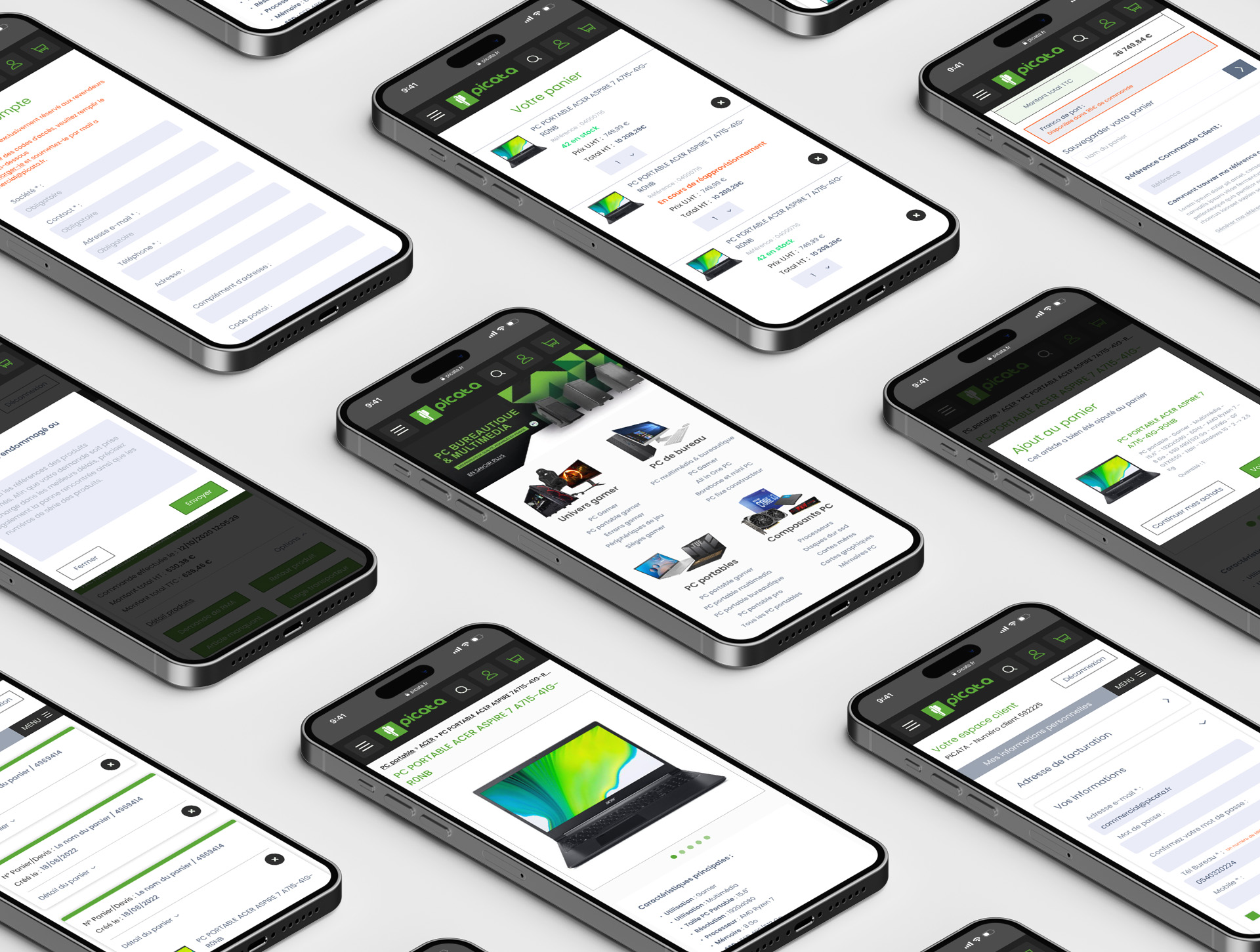
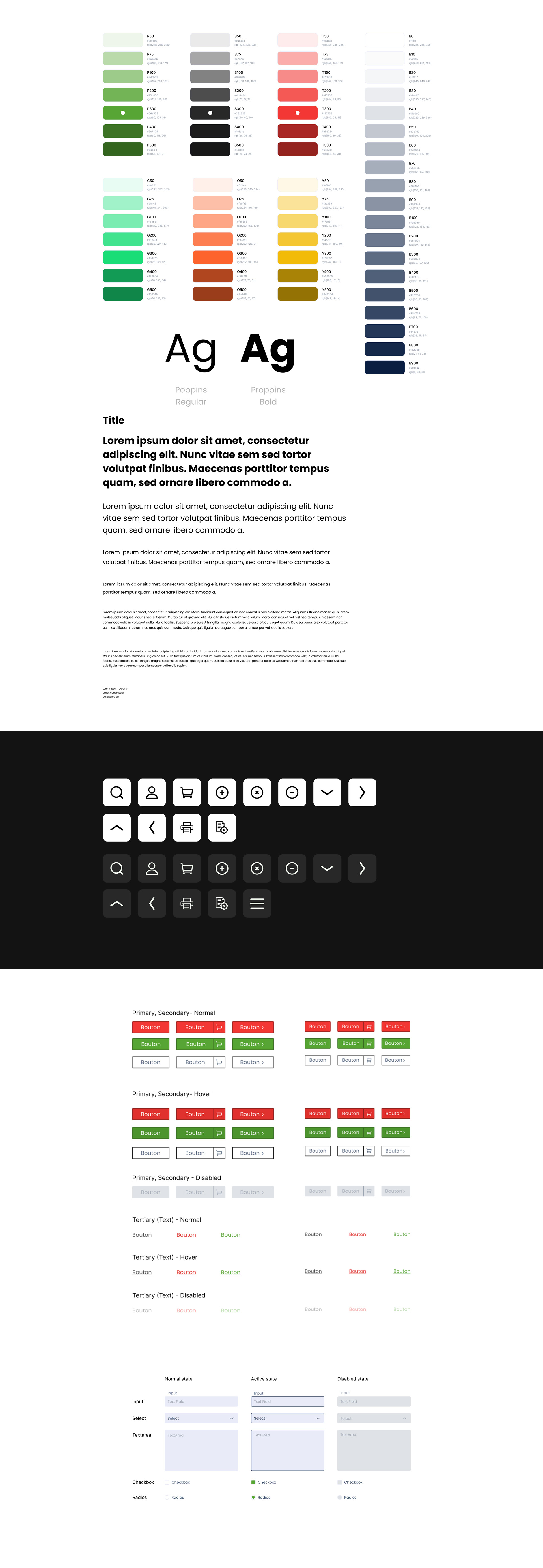
The functionalities of this website are designed to evolve in response to customer demands and advancements in technologies or new marketing techniques. To facilitate this evolution, I created a design system capable of completely overhauling the site, from the visitor interface to the client section. This enables seamless integration of future changes for the company as needed.

First sketch
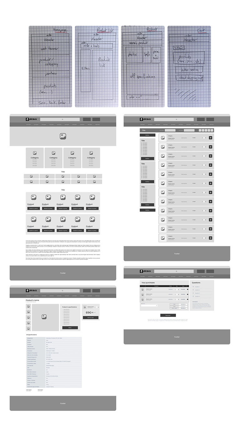
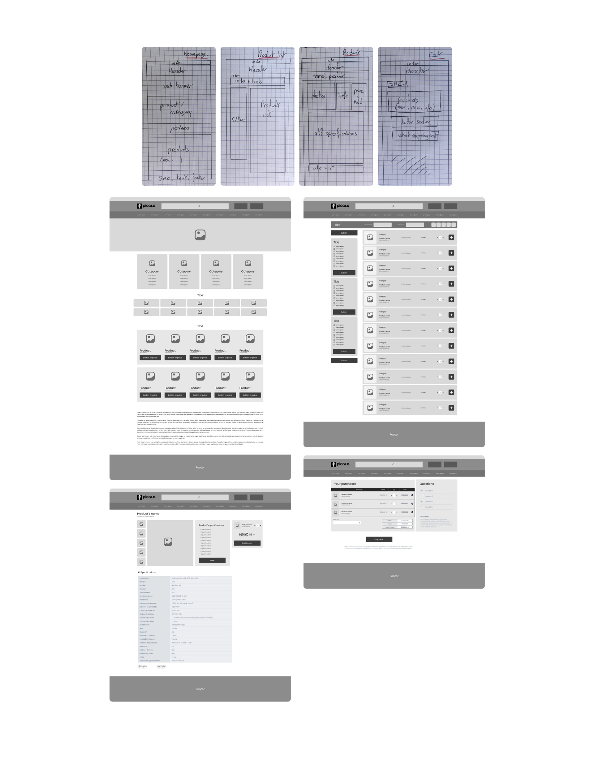
I've laid the groundwork for the technical aspect of the design process by delineating each significant part of the project. This preparation is intended to streamline the subsequent stages of the project, saving valuable time. These preliminary sketches are rough outlines representing distinct elements without intricate details.
Assembling all the process
Wireframes serve as the foundational blueprints that undergo transformation into high-fidelity models. This transformation involves a comprehensive enhancement process, incorporating colors, images, iconography, definitive text, and various design elements while addressing any necessary fixes or adjustments. This final stage is critical as it culminates in the creation of a visually enriched representation that vividly illustrates the structure and aesthetics of the website.
During this phase, the wireframes, which initially outline the layout and basic functionalities, are enriched with specific visual elements. Colors are applied to denote themes or branding, images are integrated to enhance visual appeal, iconography is included for intuitive navigation, and placeholder text is replaced with finalized content. Additionally, any identified issues or improvements from the wireframing stage are addressed to ensure a seamless and polished end product.
The transition from wireframes to high-fidelity models is pivotal as it bridges the conceptual framework of the website to its tangible, visually refined form. This process not only refines the aesthetics but also provides stakeholders with a clear and detailed representation of how the final website will look and function.
